


The Ugly Storefront Heist
Build Shopify themes that look like the old internet — without behaving like it
For the past decade, the playbook for a small ecommerce brand was simple: make the storefront look expensive.
Use a clean Shopify theme. Add oversized product photography. Choose a tasteful sans-serif font. Strip away the clutter. Make the store look like a venture-backed skincare company, even when the business is two people shipping orders from a spare bedroom. The formula worked so well it became a commodity. Today thousands of stores speak the same visual language. The logos change. The products change. The websites feel interchangeable: same white background, same announcement bar, same rounded buttons, same carefully staged lifestyle shots.
For a growing slice of younger shoppers, polish has stopped reading as legitimacy. Sometimes it reads as the opposite. A hyper-optimized storefront can look less like a real brand and more like a dropshipping operation assembled from a template last Tuesday. That opens room for a very different theme business: Shopify storefronts that look like forgotten corners of the early internet. Windows 95 dialog boxes. Pixel-art icons. Forum threads. Garish gradients. Underlined links. Visitor counters. Fake loading screens. Desktop folders. Webrings. Tiny buttons designed before anyone invented a design system.
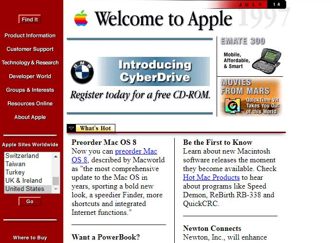
The storefront should look a little strange. It should not look broken. Hold onto that distinction, because the entire opportunity lives in it.
Here's the opportunity:
The money: A disciplined solo studio selling 20 theme licenses, 3 launch setups, and 1 drop system a month clears roughly $13,600 in monthly revenue.
Inside:
• One core theme, three drop presets to ship
• Three-tier pricing: license, setup, drop system
• Creator-first GTM with outreach templates
• The Theme Store rules that wall out copycats
Polish is no longer the only form of trust
Reddit's in-house creative agency, KarmaLab, named "nostalgia-driven storytelling" one of its defining trends for 2026. The advice to brands is blunt: revive visual references from the 1990s and early 2000s, learn the language of niche communities, and lean into low-fidelity, archival-feeling assets. Highly polished advertising, Reddit argues, reads as try-hard in communities that prize authenticity. The same report makes a related point elsewhere — that the strongest creative now feels found rather than designed.
The logic applies well beyond advertising. A storefront is brand media too. For a streetwear label, an indie cosmetics line, or a creator dropping a limited merch run, the website is part of the product. It tells customers whether the brand actually understands the culture it's borrowing from.
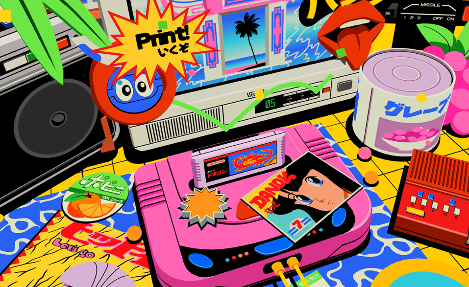
Figma's 2026 web-design guide describes neo-brutalism, or "anti-design," as a revolt against sleek minimalist templates. The look is deliberately raw: dense compositions, awkward spacing, unexpected type, hard edges, interfaces built to provoke rather than soothe. Figma points to edgy fashion brands, experimental agencies, and creative portfolios as the natural fits, and cites Balenciaga, Diesel, and Mailchimp as brands that have leaned into the style. And it's bigger than one source. Neo-brutalism shows up across multiple independent 2026 design guides.
Call it Y2K and you're directionally right but strategically short. The play isn't to sell nostalgia as decoration. It's to use anti-design as a positioning tool. The right storefront says one thing the clean template never can: this brand didn't roll off the same assembly line as everyone else. You found it somewhere interesting.
Why Shopify is the right place to steal
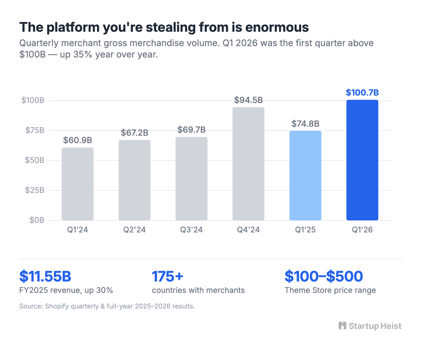
Shopify is the default infrastructure for independent ecommerce, with millions of businesses across more than 175 countries. Full-year 2025 revenue rose 30% to $11.55 billion, following 26% growth in 2024. In the first quarter of 2026 alone, merchants cleared $100.7 billion in gross merchandise volume, up 35% year over year and the first time the platform crossed $100 billion in a single quarter.
You don't need a meaningful slice of that. A niche theme studio works precisely because the platform is enormous, the merchants already pay for design, and the official Theme Store supports premium pricing. Shopify lets Theme Store developers price from $100 to $500 in $10 increments and takes a 15% revenue share, with no fee to submit.
The official store isn't the only channel. Etsy already hosts a noisy secondary market for Shopify templates, from discounted $10–$80 boutique themes to a $250 interactive streetwear theme. Search Y2K Shopify themes and you find products aimed at beauty stores, clothing brands, and small boutiques, most of it banner-driven, feminine, generic, or built on surface-level retro styling. That's a useful signal. It proves buyers exist, and it exposes the gap. The commodity market sells aesthetic skins. The better business sells conversion-ready operating systems for culturally specific product drops.
Do not build a Y2K theme library
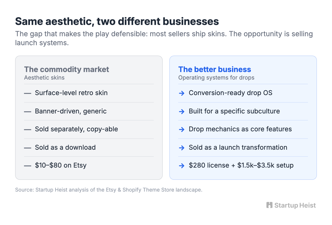
The weak version of this business writes itself. You design five eye-catching themes: a Windows desktop, a pixel-art store, a forum, a GeoCities tribute, an early social profile. You list them at $150 each and pray TikTok sends traffic. It might make some sales. It's also trivial to copy.
The stronger wedge is narrower: build Shopify themes for limited product drops that use early-internet aesthetics to manufacture discovery, urgency, and subcultural credibility.
A streetwear founder isn't paying for a pixel font. They're paying for a launch environment. They want a store that makes a capsule feel scarce. They want customers to explore. They want screenshots to travel. They want the drop to look built for their audience, not pulled from a fashion template.
So the theme treats drop mechanics as first-class features, not afterthoughts:
- countdown timers that fit the visual system
- locked collections and password-gated pages
- "coming soon" product cards
- sold-out states that stay visually interesting
- limited-stock indicators
- product-release calendars
- email and SMS capture modules
- fake system notifications
- hidden folders, easter eggs, and secret product pages
- optional audio, animation, and cursor effects with accessible controls
- reusable announcement modules for restocks and launch windows
- mobile layouts that keep the aesthetic without wrecking usability
The product isn't "make my Shopify store ugly." It's "make my next release feel like an event."
Start with streetwear, then earn the right to expand
Beauty brands, musicians, creator merch lines, gaming communities, and indie product companies could all use this visual language. Don't start with all of them. Start with independent streetwear labels.
Streetwear is the cleanest wedge because limited releases are already native to the category. Product moves through drops. The audience understands scarcity. Founders care about cultural credibility, and the storefront carries more branding weight than it would for a conventional shop. Streetwear also gives you a sharp contrast against the existing market: Etsy's streetwear Shopify results skew clean, dark, and luxury-adjacent. Many are perfectly usable. Almost none feel like underground internet artifacts.
So your first product is a single opinionated theme.
Unlock the Vault.
Join founders who spot opportunities ahead of the crowd. Actionable insights. Zero fluff.
“Intelligent, bold, minus the pretense.”
“Like discovering the cheat codes of the startup world.”
“SH is off-Broadway for founders — weird, sharp, and ahead of the curve.”


